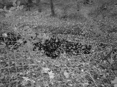
Black and white/
I picked this because I just like the way black and white photos. I'd use this technique if I ever entered a field of work that requires specialized photography. An element of art here is color (Obviously) because of the specialized palette of colors.
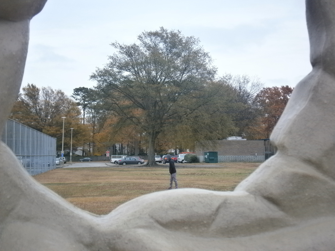
Boat n' hand/
Here we had me walk out in a grassy area and used a hole in the rock wall to make it look like I was walking on a mountain terrain instead of soggy grass. And again, if i ever entered a field requiring photography I would gladly use the boat and hand. The most prominent element of art here is size, if i was just poking out of the wall, it would not be a boat and hand.
|
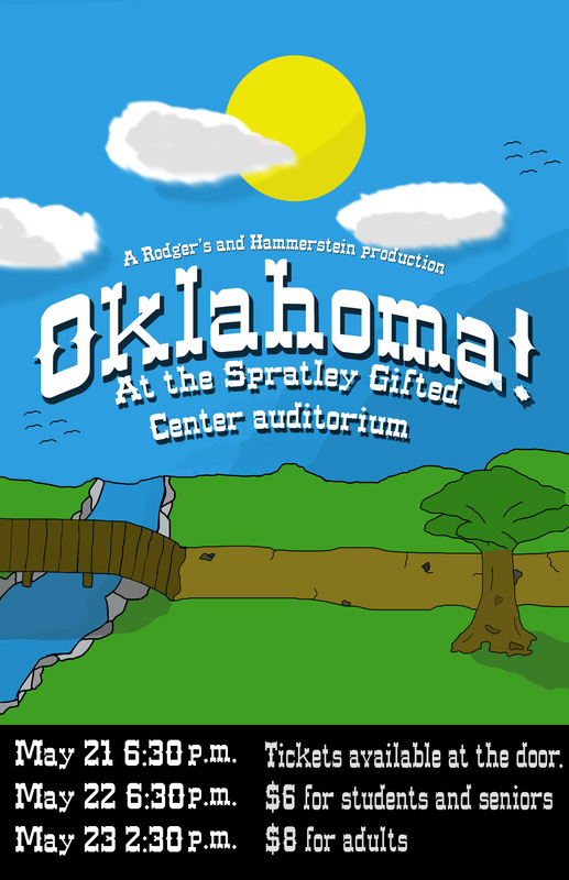
Initially in making my poster I started with the basic land and sky, then moved on to the clods and detailing the clouds. Later, I moved on to the ground and when through a couple of ideas as to what I'd put there (Field, barn and windmill, etc.) and eventually settled on a river, path and tree (With some messages from the play hidden on the tree) Then came the actual writing and lower text for information. I think I did a good job, as everything on my poster is hand drawn, which in the end was a bad idea because clip art would have looked better, but would have been less authentic. If I had more time I would have cleaned and detailed my art, and may have swapped some ideas. But overall I would give myself a %82 out of %100.
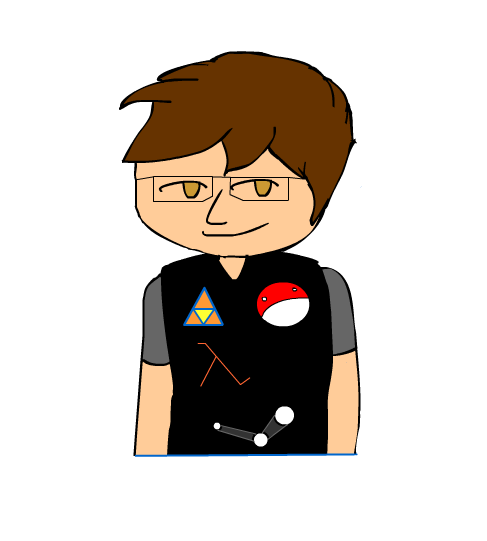
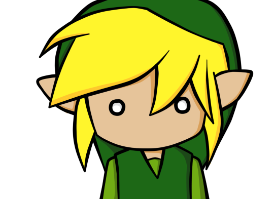
I used the Legend of Zelda: Wind Waker kind of art style, but am not happy with the product. I think I could have added something that represent me better. Currently there is a Half-life symbol, a Triforce, a Polandball, and the Steam logo. My glasses are also present.
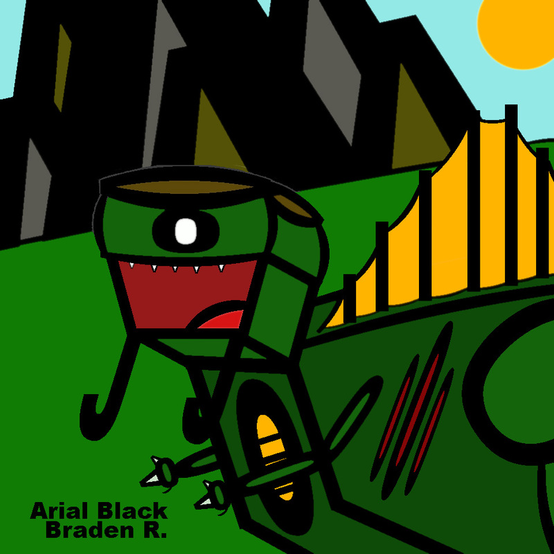
I picked this photo because it just look like you're going through a tunnel of drab, but then BAM, tons of color. It's visually interesting because I like nature and I like how he seamlessly added the tree to the photo. The student used the technique, double exposure, and honestly he used it very well. TO HIS PAGE!! Fontasaurus Rex- I used I's and O's in my fontbot aswell as a few ( or ). I used these to create the fontbots body and back spikes. I found the project to be a intermediate assignment for me, the hardest part was coloring it, as I couldn't merge all of the layers. Obviously from the picture you can tell the Fontasaurus would be found in the mountains. I wanted my colors to fit where they would be but I also wanted them to seem cartoony while real at the same time. ( And yes that is a stereotypical dad haircut ) My montage_
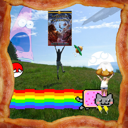
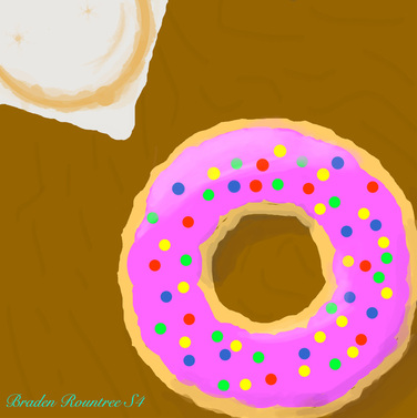
Initially I started my montage with the backdrop of a boy ( representing me ) running on a grassy hill. This symbolizes how I love the outside. I also added the book, Blood of Olympus, in my hands to show how I love books and a poor, sad, polandball who can not into space on the left, to show how I love polandball comics. As you can tell (it's pretty obvious) I love food; to show this I made the border of the picture irresistible bacon and made my sister (the family part of the photo) hold a sweet roll which is a reference to the video game, Skyrim. Honestly I can't pinpoint a major element of art. Lard Lad Donut- I made this by creating the brown backdrop in Adobe photoshop CS6. I then added the tan circle of the donut and the white square of the napkin. I also added rough edges to the donut and napkin in order to make it look less fake and plastic looking. Colors came next. I added the purple cream on the donut as well as the "sprinkles". The last things I did was shading and texture. Doing the texture involved adding marks to the table, the stain on the napkin and some last minute touches to the roughness. Shading involved creating shadows and glare around the outer and inner edges of the donut. Tablets kinda helped when it came down to actually doing intricate work but were annoying ( being left- handed ) When I would try to draw my hand hanged off the edge and I would have to constantly readjust every use. Personally though I believe shading was the most important E/P element of the art. |
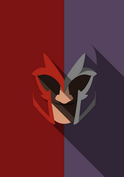
I like this photo for a few reasons. One is it is of a character of one of my favorite movie and comic series ever. I love how the left and right sides so they contrast each other so well. I also think the change of color other than to look cool is to highlight the duality and darkness we all have dwelling within us.
